I began my artistic investigation of the built environment by looking at Ai Wei Wei, and immediately was drawn to his Straight, 2008-2012 installation. Referring to his Royal Academy exhibition, Wei Wei used 90 tons of steel rebar, which were straightened after being recovered from schools that had collapsed as a result of the Sichuan earthquake that killed thousands of children. The installation that resembles seismic fault lines is a poignant criticism of the Chinese government’s failure to construct safer buildings.
“We can only build a new world if we destroy the old one.” – Ai Wei Wei
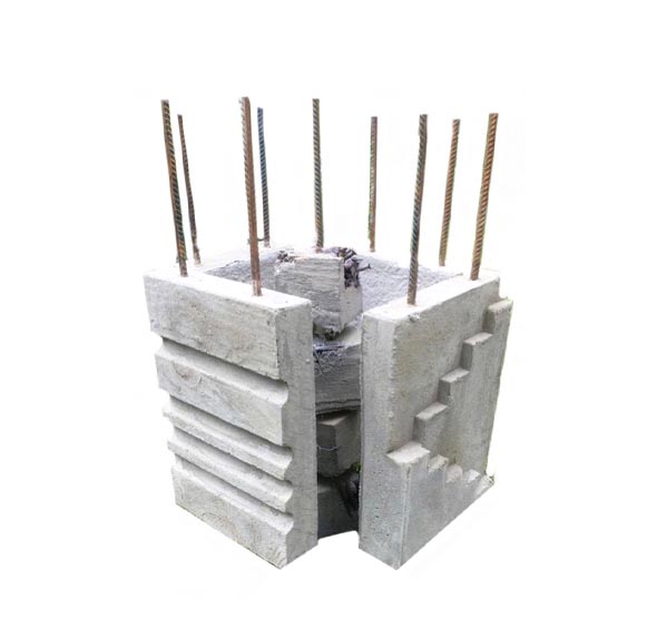
In particular, I was influenced by the rebar; its importance came to my attention after my father created a product to improve the safety on construction sites, replacing the commonly used mushroom caps that often split, thereby preventing impalement. This led me to Brutalism; rebar is used to reinforce the tensions created by these large concrete structures.
Brutalist architecture gained popularity in the late 1950s and 1960s, descending from the modernist movement. Commonly used for institutional buildings, for example libraries, courts, public housing and city halls, these huge structures can be predominantly seen all around Europe. I wanted to reflect upon the change of attitudes towards Brutalism as a celebrated inexpensive solution to the post-war housing crisis in comparison to the more recent target of huge prejudice.
Brutalism in Britain
In Britain, Brutalism is commonly associated with welfarism. Following the Second World War thousands of houses were lost by heavy bombing; with thousands of families left without homes, a quick solution had to be made. The 1945 election saw a Labour government voted in, with promises to make housing policy central to their welfare reforms. A Prefabricated Housing programme was set up immediately, where factory built single storey temporary bungalows were built across the country as a makeshift solution until more permanent housing was mobilised. In order to meet the shortage quickly whilst keeping costs down, Pre-cast Reinforced Concrete was pioneered (PRC). Made from concrete, the slabs are reinforced with steel then bolted together or constructed with a steel frame, requiring less skilled labour than a traditional build. In my coursework, the slabs reminded me of the casts made by Rachel Whiteread. Whiteread places huge emphasis on form and material as she creates minimalistic replicas of different mundane objects and architectural forms. Her work often has the purpose to commemorate as stated “Seeing a great piece of art can take you from one place to another – it can enhance daily life, reflect our times and, in that sense, change the way you think and are”. – Rachel Whiteread. Her work influenced me to respond to Brutalism by isolating the shapes that make up these larger 3D forms, thereby emphasising their simplistic nature. This is demonstrated in my concrete sculpture, where I made four blocks that all had slightly different shapes cast into them. In particular, my block with the ‘staircase’ is inspired by Whiteread’s Untitled (Stairs), 2001 installation, where she did not explicitly want to illustrate a staircase, but instead flip it in order to create a sense of ‘physical disorientation’. With my own outcomes not directly replicating concrete architecture; by taking the shapes out of their usual context I hope to ‘physically disorientate’, not only due to the visual effects this has but also, I believe this reflects the common perspective that Brutalism appears disorientated in our cities today.

The Initial Desirability of Concrete
In a 1935 documentary called ‘Housing Problems’, directed by Arthur Elton and Edgar Anstey, tenants were interviewed about the inadequate conditions of slums. The documentary was one of the only propaganda pieces that represented the peoples’ voice. As well as using the perspective of working-class men and women, it also aimed to enlighten people on different solutions that could be taken up to resolve the crisis. One included the plans for Leeds’ Quarry Road Estate, which encouraged the use of ‘pre-cast concrete reinforced by steel’ due to the speed that it could be erected. It was presented as a desirable solution, which retrospectively is ironic due to the fate of the Quarry Road Estate. I wanted to reflect the importance of the steel rebar in particular, not only due to its significance in adding stability (as echoed by Wei Wei), but also in making concrete an initially desirable material. The two of these factors appear ironic, which is why the rebar plays an important role in my work. Without the reinforcement by these steel rods the concrete lacks stability, hence why I use rebar as a metaphor for both the stability (physically) and the lack of stability (socially) of concrete. This can be reflected through the reoccurring motif of lines that appear throughout my work. In particular seen in my work influenced by the architectural drawings of Viktor Timofeev and additionally in my choice to make the rebar exposed in my sculptures. Whilst I wish for this to act as a symbol, the linear juxtaposes the bold shapes thereby creating visually intriguing outcomes also creating a sense of depth and perspective that cannot be achieved through flat colours, or incorrect use to tones. Architectural drawings have been a good source of inspiration in my 2D work.
Introducing Colour
It was between 1920 and 1930 that a culture emerged that glorified art, restructuring the fractured European society (Futurism, Surrealism, and Russian Constructivism). Le Corbusier at this time was becoming hugely influential, celebrating modernism. The Swiss-French architect, painter and designer had a preference for reoccurring forms, uniformity in the built environment, and prefabricated elements. It was this that led to his contribution to providing better living conditions, becoming influential in urban planning, making him a pioneer of brutalist architecture. His thoughts behind tower housing blocks were that they were “rises vertical to the sky, open to light and air, clear and radiant and sparkling.” This enforced the brutalist idea of ‘streets in the sky’. Le Corbusier is celebrated today, with many of his buildings popularised, for example the Unité d’Habitation, being regarded as a UNESCO World Heritage Site. The success of Corbusier’s architecture can be seen through his use of colour, which I wanted to research into. While his theory involved systematically ‘using natural colours to create atmosphere, applying synthetic pigments for contrasts and deploying transparent synthetic pigments to alter surfaces without effecting how the eye perceives space’, I believed that in my own work the use of colour only distracts and does not help create my intended aesthetic. However, I can appreciate the significance of colour, especially in my own travels to Poland, where colour has been successfully used to rejuvenate brutalism, but also in understanding colour theory, where I looked to Josef Albers in order to better understand the effect colour has in changing the perception of greys. This allowed me to become more calculated in my use of different tones, but also to think about the perceptions of warm greys, vs cool greys.
Brutalism in the Eastern Bloc
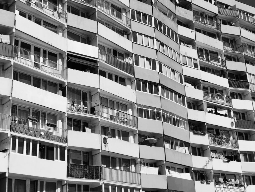
Despite the success of Le Corbusier, the common perception of Brutalism quickly deteriorated. Brutalism was commonly associated with Totalitarianism due to its popularity in the building of governmental institutions. Also, its connections with Soviet countries and Communist regimes is influential in its links to tyrannical ruling. The Eastern bloc contains possibly the most amount of brutalist structures than any other area, belonging as a constant reminder of a recent turbulent history. In particular, Polish Brutalism bears the weight of the countries’ complex legacy. These concrete mega structures stand as emblems of the far-left communist ideology that adopted this simplified method of construction. Poland was severely flattened during the war by German forces and with the Cold War that followed, with the economy suffering, the state began nationalising industry and land. With their focus on reconstructing cities, the principles of Soviet Socialism were implemented, and high rises were almost mass produced. The extent of this urban planning movement came to my attention during my travels to Poland. When in Gdansk I visited the apartment blocks known as the Falowiecs (fala means ‘wave’ in Polish) which are particularly significant due to the fact they are among the longest on the planet. Built during the 1960s and 70s, these eight massive complexes built in waves, some stretching for a mile, are estimated to accommodate 12,000. In light of the earlier paragraph about the use of colour, it intrigued me as to the choice of putting brightly coloured cladding on the face of these Falowiecs.

The Decline of Brutalism as Reflected Through Film
This association made between tyranny and Brutalism is represented in film. Dystopian films often use these concrete structures as symbols of oppression and social disorder. This can be seen through the 1971 film Get Carter based upon a gangster seeking revenge. Also, Stanley Kubrick’s A Clockwork Orange which uses the Thamesmead estate in London as the home of gang-leader, Alex. Additionally, the base of an evil corporation in the 1987 film Robcop uses Dallas City Hall. This architecture also appears as the base of many Bond villains. This negative portrayal in film only confirmed common attitudes regarding Brutalism.
This is most evident with London’s Thamesmead Estate. A Clockwork Orange received huge criticism upon its release in 1971, apparent through Warner Bros choice to withdraw it from UK distribution. The film provocatively indulges in violence, anger and misogyny through its villain, Alex, whilst also turning the tables, depicting the failure of state through the inhumane punishment of Alex by the police. This only confirmed the growing stigma towards brutalism in the 70s. Ironically the estate soon became a symbol of urban decay, becoming derelict. The estate was built upon London’s Erith marshes, where the desirability of the original scheme focused upon the use of water as a calming influence on the residents. However, Thamesmead soon became known for its crime, now being the centre of regeneration and demolition conversations. Other derelict estates include Aylesbury in London, Hulme Crescents in Manchester and Leeds Quarry road. All have been the target of demolition, due to the deterioration of their appearance and the social issues that occurred within them. Prejudice towards these British estates was demonstrated in the 2005 documentary Demolition on Channel 4, where the public were able to vote which estates they wished to be knocked down. Bournemouth’s IMAX cinema, Northampton’s Greyfriars bus station, Sheffield’s Park Hill, Trinity Centre Car Park (featured in the film Get Carter) were all among those targeted in the programme. Overall there were 12 targets named “The Dirty Dozen”. The degrading conditions of these buildings are well represented by painter David Hepher, whose experimental use of unconventional mediums aim to mimic the stained, graffitied, rough surface quality of concrete. He does so by either painting concrete areas onto the canvas, or on one case using a layer of shuttered concrete as the canvas itself. This has influenced me to experiment with different mediums such as plaster, concrete, PVA etc.
Brutalism at Home
There are current conversations emerging about the brutalist structures local to me. Many, in Norwich, are aware of the controversy surrounding Anglia Square, being situated on Magdalen St next to Norwich’s most untouched, historical streets. Around the corner from the opposing shopping centre, cinema, car park and office complex, is Tombland where our Norman-built cathedral and the Close sits, as well as Elm Hill our cobbled Tudor street. The straight rigid lines of Anglia Square’s brutalism juxtapose the unsymmetrical bowing architecture of Tombland. Anglia Square has been involved in a current £271 million regeneration scheme, requiring its demolition. Despite its deterioration, there are many locals that are against the proposal, stating that it deserves its place in Norwich and that the new plan did not include the council’s new requirement for affordable housing. Its controversy and derelict state intrigued me, meaning to begin my coursework I took a range of photos that I initially directly painted from. I responded to Anglia Square in a number of ways, creating linear sketches from archived construction photos, extracting the different shapes that make up the buildings on photoshop, and simplifying the structures through painting those shapes with random tones of grey. These were all experiments in order to trial the differing ways I could portray the 3D forms on the 2D.
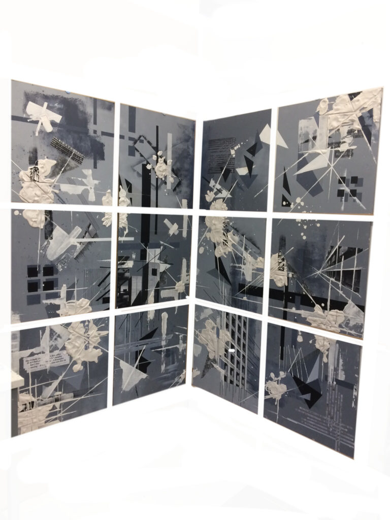
In responding to Brutalism, I wanted to convey an appreciation of the architecture’s aesthetic (harsh greys and rigid geometric forms) and how this informs the perception of its strength. Although additionally portray the paradox that is it’s instability, in light of its social, cultural, economic history. I immediately became fascinated by exposed rebar during the construction process due to its visual appeal; the skeletal, linear quality of the rebar added relief to the block appearance of the concrete (celebrated in my concrete sculpture). Upon researching rebar, its significance in providing stability to the concrete made it become somewhat of a metaphor for the strength of concrete. This would enforce the reoccurring motif of bold shapes and lines within my work. Additionally, having researched the construction process and in particular pre-cast concrete, I enjoyed how my own work processes appeared to mimic them or in fact do the opposite and deconstruct, demonstrated through my reoccurring method of extracting the shapes that make up the brutalist forms. This would feed into my efforts to portray the decline in attitudes towards brutalism over the years, appearing as though my work was almost portraying demolition. Extracting the shapes, revealing my skeletal linear work almost has a sense of exposing the vulnerability of brutalism; once again adding to my earlier metaphor. Despite this, the simplistic nature of my work, (paying close attention to different shapes and tones) seemed to present the aesthetic that I appreciated most about this architecture (harsh lines and gloomy greys). Also, I felt as though the history informing my ideas was not explicit enough, alone, with just these early experiments. Having been inspired by Gerry Judah ‘Art from the Ruins’, I wished to adopt the explicitness of his sculptures in their links to modern warfare and the destruction caused. Consequently, I began experimenting with plaster and found it was an effective way of portraying demolition / the social upheaval surrounding brutalism, and it was a good juxtaposition to the rigid nature of my paintings. To conclude my investigation of brutalism, I did not want my final piece to simply be a canvas, for the very reason that I believe brutalism is much more than just a block in our urban landscape. I also believed it would not do my feelings towards this subject justice. That being said, I chose to paint 12 square boards, with equal spacing in between, presented around a corner. Firstly, this would make my work more interactive, appearing different to the viewer from more than just one angle, but also this would almost visually portray a tower block. By their very nature, the boards themselves echo my processes, representing the extraction of shapes (12 separate squares), and displaying an angle (the boards themselves being on a 90-degree angle to each other). On my boards, I combined my experimentations: painting isolated shapes, repeating lines, textures and additionally adding ink transferring and sticking headlines and photographs. Whilst I aimed for each board to work independently, I also wanted them to interact with each other thereby juxtaposing the rigid nature of brutalism. I did this by firstly having painted forms interact over more than just one board, but also by adding plaster that appeared splattered. The plaster confirms the context of Brutalism addressed in this essay, appearing at odds with the straight lines but also seeming not contained, as it splatters across boards, representing the failed stability of brutalism. Straight lines were dragged through the plaster in order to maintain harmony between the plaster and my paintings, further emphasising the reoccurring nature of my work. In making sure the context of my work can be understood, I edited a compilation of audio, taken from documentaries dating between 1935 and 2017, showing the change over time in attitudes towards Brutalism.
